Pimp my Font – VS Code Style
By codeSTACKr
Published: Feb 17, 2023“
Become A VS Code SuperHero Today: https://vsCodeHero.comJoin my Discord developer community: https://discord.gg/A9CnsVzzkZ
Code Tip of the Day:
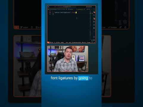
Font ligatures are special characters that combine multiple characters into a single symbol.They can help your overall coding experience and make your code more readable and elegant, especially when it comes to symbol like not equal, greater than or equal, and less than or equal.
But they are definitely up to user preference. Some people love them, and some hate them. Personally, I like them.
In Visual Studio Code, you can easily enable font ligatures by editing the settings.json file, and adding `”editor.fontLigatures”: true`.
You will also need to use a font that supports ligatures because not all do.
Some popular fonts like Fira Code, Cascadia Code, and Hasklig which extends Source Code Pro are great coding fonts that have support for ligatures.
And my custom STACKr Code font which is included with my VS Code Hero course has ligature support as well.
Tools I use:
- codeSTACKr VS Code Theme: https://marketplace.visualstudio.com/…
- STACKr Code Font (Exclusive to my VS Code Course – https://vsCodeHero.com)
- SuperHero Extension Pack: https://marketplace.visualstudio.com/…
Show support!
- PayPal: https://paypal.me/codeSTACKr
Watch Next:
- Playlist: Web Development For Beginners – https://www.youtube.com/watch?v=Ez4yH…
Connect With codeSTACKr:
- Website: https://www.codestackr.com
- Twitter: https://twitter.com/codeSTACKr
- Instagram: https://instagram.com/codeSTACKr
- Facebook: https://facebook.com/codeSTACKr
”
Tag: fonts
[#Photoshop #Tutorials] Photoshop Tutorial – Neon Text Effect
Photoshop Tutorial – Neon Text Effect
By Photoshop Tutorials
Published: Feb 08, 2019“
This Photoshop tutorial covers how to create a realistic neon text effect with wires. We’ll be working with styles, filters, free textures and fonts & much more. If you enjoyed this tutorial, please slap a like on it. It lets me know you’ve liked it.
DOWNLOADS/Stocks!
Photoshop Actions, Brushes, Stocks and much more! Start your free trial today!”
[#Photoshop #Tutorial] How To Match Fonts in Photoshop
How To Match Fonts in Photoshop
By Photoshop Training Channel
Published: Jan 28, 2022“
Learn to use the incredible Match Fonts feature in Adobe Photoshop!
”
[#Photoshop #Tutorials] Photoshop Tutorial: Paint Text Effect
Photoshop Tutorial: Paint Text Effect
By Photoshop Tutorials
Published: May 02, 2018“
In this Photoshop tutorial, I will share some really easy techniques on how to create a paint text effect. We’ll be working with fonts, different brushes, and other tools. If you enjoyed this tutorial. Please leave a like.
Unlimited Downloads on Envato Elements, Photoshop Actions, Brushes, Stocks and much more!
Stock Downloads
http://www.photoshoptutorials.tv/how-…
Audio Provided By?
https://www.youtube.com/audiolibrary”
[Design] All About Titling Fonts
From CreativePro.com –All About Titling Fonts:
“
When looking for just the right display typeface, have you considered a titling font? If not, you are missing out on an entire category of possibilities. Titling fonts are typefaces designed specifically for headline or display usage. They are usually all caps, but some can contain lowercase, and even small caps! Titling fonts differ from their text counterparts in that their scale, proportion, and design details have been tweaked to look best at larger sizes. They often have an increased weight contrast between the thick and thin parts of the characters, and can sometimes have more condensed proportions than their text-sized cousins if part of a family. This sub-category of display typefaces tend to have a refined, even dramatic look ? qualities that make them an excellent choice for books, magazines, movie titles and sequences, logos, signage, or any usage that calls for large-sized type benefiting from finessed design details as well as a touch of elegance. Titling fonts can be part of an existing typeface or a stand-alone design. They are most often- but not always – serif designs with pronounced weight contrast, as it is the thin strokes that vary the most in typestyles intended for text…
”
[#Design] Historical Seattle on a Typographic Pub Crawl
From CreativePro.com –Stepping Through Historical Seattle on a Typographic Pub Crawl:
“
When I found out that the annual North American typography conference, TypeCon, was going to be in my hometown of Seattle, I decided to create a conference event that would somehow provide a unique experience to typographers from out-of-town. My love for the city is deep since I’ve lived here my entire life (aside from spending my undergraduate years in Spokane, WA and at graduate school in Scotland). Seattle – nestled between the water and the mountains – offers everything our art-creating, coffee-drinking, airplane-making, software-programming locals desire. The knowledgeable Paul Shaw was already scheduled to give his famous TypeCon typography walk in downtown Seattle, so I wanted to choose a different neighborhood and add a little something to make it unique. After all, my first font release, Bemis, in 2013, was based on the 1917 inscription on the historic Bemis building in Seattle. I loved the look of the high-waisted capital letters, so I created a historical revival inspired by the B-E-M-I-S letterforms inscribed onto the front of the brick building. KUOW and The Seattle Times found the project intriguing, so it received a bit of publicity. So combining my interests in typography and in historical Seattle, it seemed as though I might have something…
”